When it comes to designing your bedroom, the layout is a critical factor that can either elevate your space into a serene, stylish retreat or leave it feeling cramped, cluttered, and impractical. While selecting paint colors or shopping for decor may be more fun, the truth is that the bedroom layout should always be a priority. If you get it wrong, your room will not only feel awkward to navigate but also fail to offer the restful atmosphere you crave.
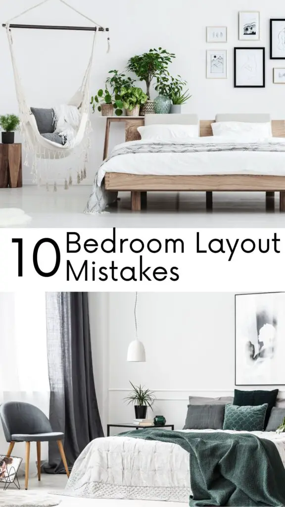
It’s easy to make mistakes when laying out a bedroom, especially because we tend to stick to familiar furniture arrangements. But some of the most common mistakes can affect the functionality and aesthetic appeal of the space. From improper bed placement to overstuffing your room with furniture, these errors are more common than you think. The good news? Even small tweaks can make a world of difference.
In this article, we’ll explore the nine most common bedroom layout mistakes, how they can negatively impact your space, and what you can do to fix them. Whether you’re working with a large master bedroom or a cozy guest room, these expert tips will help you create a layout that maximizes both style and function.
1. Neglecting Bed Placement
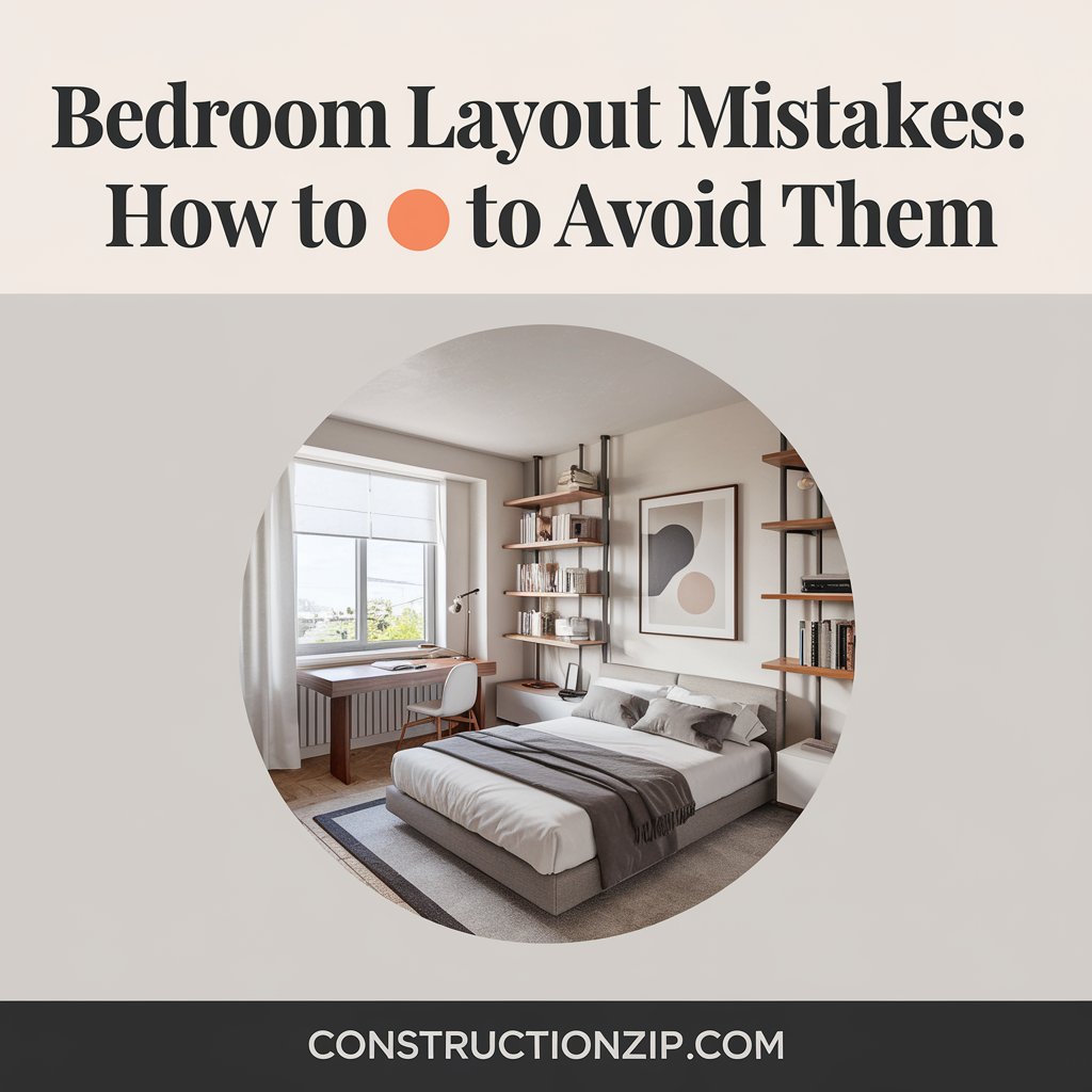
The bed is the heart of the bedroom, and its placement is the first decision you should make. One of the most common mistakes people make is not considering where to put the bed before arranging other furniture. Interior designer Kathy Kuo emphasizes, “The bed’s position sets the tone for the whole room.” Ideally, you should be able to see both the door and at least one window from the bed while leaving enough space to comfortably walk around both sides.
Getting bed placement wrong can make the room feel disorganized or cramped, especially if the bed blocks natural light or doors. Kristina Khersonsky from STUDIO KEETA suggests avoiding putting the bed adjacent to the door, as it can disrupt the flow of energy—an important consideration in Feng Shui design.
Tip:
- Prioritize bed placement before anything else to ensure the room feels balanced.
- Ensure at least 2-3 feet of space around the bed for easy movement.
| Mistake | Effect | Solution |
|---|---|---|
| Poor bed placement | Makes the room feel awkward and hard to navigate | Prioritize bed placement with visibility of door/window |
2. Choosing a Bed That’s Too Large
Who doesn’t dream of sinking into a luxurious king-size bed? While that sounds great, a bed that’s too large for your space can easily overpower the room. A bed that’s too big leaves little room for other essential furniture like nightstands, dressers, or a reading chair, creating a claustrophobic vibe.
“If your bedroom is on the smaller side, opt for a queen-sized bed instead,” advises Kristina. The key is balance; choosing the right size bed will ensure the room feels open and welcoming.
Tip:
- Match the bed size to the room dimensions.
- Use furniture that complements the size of the bed and the room.
| Room Size | Recommended Bed Size |
|---|---|
| Small Bedroom | Queen Bed |
| Large Bedroom | King Bed or Four-Poster |
3. Cramming Too Much Furniture
Another common bedroom layout mistake is trying to fit too much furniture into the space. Less is more when it comes to creating a serene bedroom environment. Overloading the room with dressers, chairs, nightstands, and vanity tables can make even the most spacious room feel crowded and cluttered.
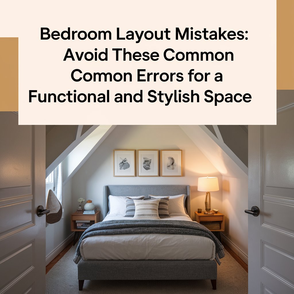
Katie Lion, senior interior designer at Kitesgrove, suggests rethinking the traditional bedroom layout to avoid overstuffing the space. “Built-in storage and multi-functional furniture can help you make the most of smaller spaces,” she says.
Tip:
- Stick to the essentials and choose multi-functional pieces to save space.
- Leave enough “negative space” for the room to feel open and airy.
| Furniture Overload Effects | Solution |
|---|---|
| Cluttered, chaotic feel | Opt for built-in storage and multifunctional furniture |
4. Under-Furnishing the Room
On the flip side, under-furnishing a room can leave it feeling sparse and uninviting. While minimalism is a popular design trend, going too far can make your bedroom feel incomplete. In larger spaces, leaving too much empty room between furniture can disrupt the flow and make the layout feel disjointed.
According to Camilla Clarke, creative director at Albion Nord, larger rooms can benefit from more substantial furniture, like four-poster beds, which help to fill the space and create a cozier atmosphere.
Tip:
- In larger rooms, fill space with functional furniture like a seating area or larger storage units.
- Consider statement pieces like four-poster beds or large rugs to anchor the space.
| Under-furnishing Effects | Solution |
|---|---|
| Sparse, disconnected feel | Add larger furniture and statement pieces |
5. Not Utilizing Niches and Alcoves
If your bedroom has unique architectural features like niches or alcoves, not using them effectively is a missed opportunity. These small nooks can be transformed into valuable storage or display areas. Instead of working against them, consider how they can complement your overall design.
“Fitted closets or storage units are perfect for maximizing alcoves,” suggests designer Brigitta Spinocchia Freund. Custom cabinetry or shelves can turn these spaces into organized and stylish storage solutions.
Tip:
- Turn alcoves into built-in storage or seating areas.
- Match finishes to your walls for a seamless look.
| Missed Opportunity | Solution |
|---|---|
| Unused niches and alcoves | Install custom storage or shelving |
6. Blocking Windows and Natural Light
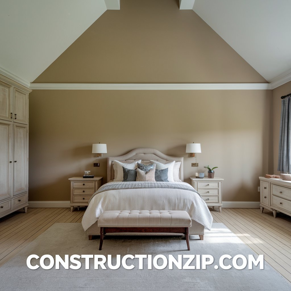
Windows are one of the most important features of any bedroom, as they provide both natural light and a view. Placing furniture, particularly large pieces like beds or dressers, in front of windows can block light and make the room feel darker and smaller.
Interior designer Susie Atkinson recommends positioning the bed to face a window whenever possible, allowing natural light to flood the room. If placing the bed near a window is unavoidable, opt for lower furniture or a bed frame with a low headboard to maintain the flow of light.
Tip:
- Avoid placing large furniture in front of windows.
- Use light, sheer curtains to allow natural light to filter through.
| Mistake | Effect | Solution |
|---|---|---|
| Blocking windows and natural light | Diminishes brightness and makes the room smaller | Position furniture away from windows |
7. Inadequate Lighting
A common mistake in bedroom design is overlooking proper lighting. Poor lighting can make even the best-designed bedroom feel dull and uninviting. Relying solely on overhead lighting or forgetting to layer your lighting can create harsh shadows and leave certain areas of the room too dim.
Heidi Caillier, a seasoned interior designer, suggests incorporating a variety of lighting sources, from bedside lamps to sconces, to create a warm and inviting atmosphere. “Bedrooms need ambient lighting for a cozy glow,” she says.
Tip:
- Layer your lighting by including task lights, ambient lights, and decorative fixtures.
- Place lamps strategically to enhance reading and relaxing areas.
| Lighting Mistakes | Effect | Solution |
|---|---|---|
| Lack of layered lighting | Creates harsh shadows and dim areas | Use a combination of ambient, task, and accent lighting |
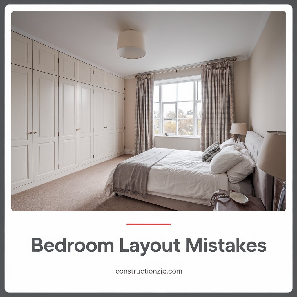
8. Forgetting Closet Storage
Inadequate closet space is a common oversight when designing a bedroom. Without proper storage solutions, bedrooms can quickly become cluttered, undermining both the aesthetic and functionality of the space.
According to Philipp Nagel, director at Neatsmith, incorporating fitted furniture can provide practical and stylish storage options. Prioritize closet space that suits your needs to ensure your room stays organized and clutter-free.
Tip:
- Plan for more storage than you think you’ll need.
- Invest in fitted wardrobes or customized storage solutions.
| Common Storage Mistake | Effect | Solution |
|---|---|---|
| Insufficient closet storage | Leads to clutter and disorganization | Plan for ample storage space with built-in options |
9. Using the Wrong Rug Size
Rugs are key elements in bedroom design, offering comfort and defining the space. However, choosing a rug that’s too small or too large can throw off the balance of the room. A small rug may look like an afterthought, while a rug that’s too large can make the room feel crowded.
Heidi Caillier advises selecting a rug that extends at least a couple of feet beyond the edges of the bed to create a cohesive and balanced look.
Tip:
- For queen or king-sized beds, opt for an 8×10-foot rug.
- Ensure the rug leaves some floor space visible to create an open feel.
| Rug Size Error | Effect | Solution |
|---|---|---|
| Disproportionate rug sizes | Throws off room balance and cohesion | Select a rug that complements the bed size |
In conclusion, getting your bedroom layout right is essential to creating a space that is both beautiful and functional. Avoid these common mistakes, and with a few thoughtful adjustments, your bedroom can be transformed into the perfect retreat.